
Wildfires have again been prominent in the news across Canada. Their effects extend beyond the land directly affected by fire, reaching communities, transport networks, public health, emergency services, local economies and ecosystems. On 9 July 2026, the Government of Canada reported 796 active wildfires nationally, including 60 full-response fires that were out of control. At that point in the season, 3,137 fires had been recorded and 1.4 million hectares had burned.
National totals indicate the scale of a fire season, but they cannot show which communities are close to an incident, how its mapped extent has changed or which infrastructure may be potentially exposed. Those questions require time and location to be considered together.
We therefore used Power BI and Icon Map to build a three-page report around three questions:
- Where have wildfires been reported, and what are their current characteristics?
- How have reported fires and estimated fire perimeters developed over time?
- Which population centres and aviation facilities may be geographically exposed?
The report uses fire data available up to 5 August 2026 for its development and potential-exposure views. Later incidents described in current news coverage will not necessarily appear.
Important: This is an independent analytical demonstration. It is not endorsed by the Government of Canada and must not replace official wildfire warnings, evacuation information or emergency guidance.
Why location matters
Wildfire impacts operate at several geographic scales. At the fire itself, analysts may need to understand its reported size, stage of control, response type and changing extent. In the surrounding area, attention turns to settlements, access routes and operational infrastructure. Farther away, smoke can affect air quality and health, while disruption to transport, tourism, forestry and supply chains can spread the consequences beyond the immediate region.
No single dashboard can represent all those effects. For this demonstration, we kept the potential-exposure analysis focused on population centres and aviation infrastructure. Airports, heliports and seaplane bases may be close to fire activity, may face operational disruption or may support firefighting and emergency response. Population centres add human context, although the figures used here come from the 2021 Census and are not current evacuation estimates.
The aim is not to claim impact. It is to show how location intelligence can move a report from plotting incidents towards asking a more useful spatial question: what is nearby?
Understanding the source data
The report combines four types of open data.
Agency-reported fires
The Canadian Wildland Fire Information System (CWFIS) publishes national reported-fire data assembled from provincial, territorial and federal fire-management agencies. Records include the responsible agency, location, reported fire size, cause, response type, stage of control and observation dates.
The word reported is important. Each record represents a managed incident reported by an agency. Its point on the map is the agency-reported fire location, not a polygon showing every area affected.
The latest record for each fire supports the monitoring page, while the reported-fire time series shows how attributes changed between observations.
Satellite-derived M3 perimeter estimates
CWFIS also provides M3 polygons derived from satellite hotspot observations. These offer an estimated spatial extent and may have multiple dated versions.
They add a geographic shape where the reported-fire dataset provides a point, but the two sources are not interchangeable. An M3 polygon is not necessarily an authoritative incident boundary, a final burned-area polygon or confirmation that everything within it has been damaged.
The report therefore uses three distinct terms:
- reported fire location for an agency point;
- reported fire size for its numeric size in hectares;
- satellite-derived fire perimeter estimate for an M3 polygon.
Population centres and aviation infrastructure
Population-centre boundaries, classifications and population figures come from Statistics Canada's 2021 Census products. Aviation facilities come from its Open Database of Infrastructure and include airports, heliports, seaplane bases and other facility types.
Together, these datasets add contextual geography to the fire information. The census figures describe the 2021 population of each centre; they do not estimate how many people are currently present, affected or evacuated.
Preparing the spatial data
Much of the work in a spatial Power BI report happens before the map is configured. The visual needs clean coordinates, valid geometry, stable identifiers and a model that behaves predictably under filtering.
We used DuckDB and its spatial extension to standardise the source data, transform coordinate systems, validate geometry, create hectare and square-kilometre measures, perform spatial comparisons and export model-ready Parquet tables for Power BI.
Associating reported fires with M3 polygons
Reported fires and M3 polygons do not share a guaranteed one-to-one identifier. A simple nearest-neighbour match would be unreliable because several fires can occur close together and a polygon cluster can evolve over multiple dates.
We treated the task as a candidate-matching problem using available identifiers, observation dates and spatial distance. Matches were assigned confidence categories, with ambiguous cases available for review or exclusion. Bridge tables in the Power BI model then allow a reported fire to relate to one or more dated map features.
These are analytical associations, not official links confirmed by a fire agency.
Preparing WKT for Power BI
The estimated perimeters are stored as Well-Known Text (WKT), and some exceeded Power BI's practical text-value limit. Coordinates were rounded to five decimal places before the WKT was divided into ordered chunks for import. A DAX measure reconstructs the geometry when the map is rendered.
This retains the polygons' relationships to dates, fires and report filters while illustrating a broader lesson: GIS-grade geometry is not always report-grade geometry. Spatial data should be prepared for the scale, performance and interaction the report actually requires.
Report page one: monitoring reported fires
The first page provides a monitoring view of agency-reported fires.
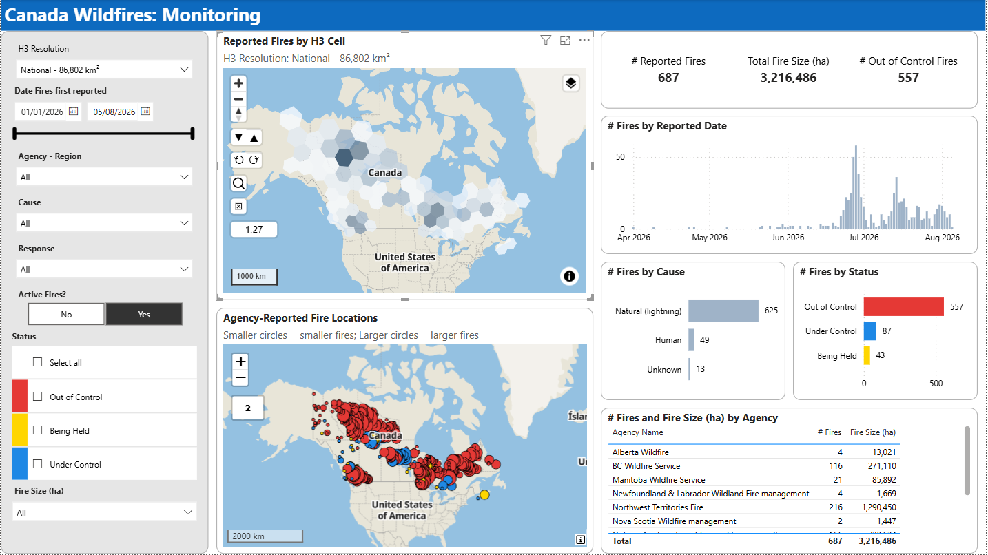
An H3 map groups fires into consistently sized hexagonal cells. This avoids relying on administrative areas that vary greatly in size and makes concentrations easier to compare. A resolution slicer lets the user move between broad regional patterns and more localised detail, with the approximate cell area shown in plain language.
A second map displays individual reported fire locations as circles. Colour communicates stage of control: red for out of control, yellow for being held, blue for under control and grey for extinguished.
Circle size represents reported fire size in hectares. We used bands rather than a continuous scale because wildfire sizes vary enormously. With a linear scale, one exceptionally large fire can make most other incidents almost invisible.
The maps answer complementary questions:
- Where are fires concentrated? The H3 map shows the broader pattern.
- Where is each reported fire, what is its status and how large is it? The proportional-circle map provides the detail.
Cards and charts summarise reported fires, total reported fire size, reported dates, causes, control status and agencies. Slicers filter the page by agency and region, cause, response, active status, control status and fire-size band.
Report page two: showing fire development over time
A current map is useful, but it hides the path taken to reach the current situation. The second page brings time and location together.
The map combines circles for reported fire locations with WKT polygons for satellite-derived perimeter estimates. A play-axis visual controls the animation date. As it advances, fires appear, available perimeter versions change and the accompanying charts update.
Each polygon version is linked to a date and, where an association was available, to one or more reported fires. Perimeters can therefore respond to agency, cause and control-status selections rather than acting as a static background layer.
The animation makes it easier to see when fires first appeared, how incident numbers increased, where perimeter estimates became available and how those estimates changed. Animation adds value here because temporal order is central to the analysis, turning dated observations into an interpretable sequence.
Report page three: from monitoring to potential exposure
The third page asks which population centres and aviation facilities are geographically close to active fires.
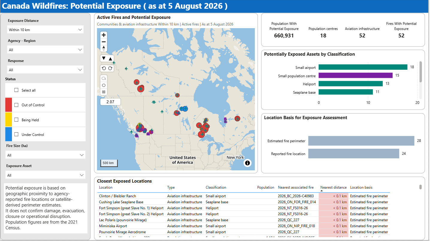
The map uses purple building icons for population centres and teal aircraft icons for aviation infrastructure. The exposure calculation uses the best available spatial basis for each fire and date. Where an associated perimeter is available, distance is measured from that geometry; otherwise, the reported fire location is used.
The location basis for exposure assessment chart makes that distinction visible. Users can choose cumulative thresholds such as within 5, 10, 25 or 50 kilometres, exclusive ranges such as 5–10 kilometres only, or assets that intersect an estimated perimeter.
Cards summarise potentially exposed population, population centres, aviation facilities and associated fires. A classification chart breaks down the selected assets, while the detail table lists locations, classifications, nearest associated fires, distances and assessment bases. Map tooltips add census population or aviation codes without overcrowding the page.
Potential exposure is not confirmed impact
Potential exposure is based on geographic proximity to an agency-reported fire location or satellite-derived perimeter estimate. It does not confirm damage, evacuation, closure or operational disruption. Wind, terrain, fuel, weather, suppression activity and official incident assessment all matter.
Likewise, the population KPI uses 2021 Census figures. It provides context, not an estimate of people currently affected. The calculation may be precise while its interpretation still requires care.
What Icon Map contributes
The report combines several Icon Map capabilities in one Power BI experience:
- H3 cells for consistent spatial aggregation;
- proportional circles and conditional status colours;
- image markers for communities and aviation facilities;
- data-bound WKT polygons for dated perimeter estimates;
- multiple simultaneous layer types;
- tooltips, cross-filtering and geographic selection;
- date-driven animation when combined with a play axis.
The value is not simply that these features can be drawn. Each layer remains connected to the Power BI semantic model, so agency, cause, response, status, date, fire size and exposure selections can affect the maps and conventional visuals together.
The report progresses through three levels of spatial analysis:
- Aggregation: where are reported fires concentrated?
- Development: how do observations and estimated perimeters change over time?
- Association: which contextual assets are nearby?
Limitations and responsible interpretation
Open data makes the demonstration possible, but its limitations must remain visible:
- The report is independent, is not endorsed by the Government of Canada and must not replace official wildfire services or emergency instructions.
- Reported fire locations and satellite-derived M3 perimeters describe different aspects of wildfire activity.
- M3 polygons may be incomplete, delayed or uncertain and are not final burned-area boundaries.
- Associations between reported fires and polygon clusters were derived analytically.
- Proximity indicates potential exposure, not confirmed impact.
- Population figures come from the 2021 Census.
- Results represent the report's stated snapshot, not necessarily the latest situation when the article is read.
Fire data is sourced from Natural Resources Canada and CWFIS. Population and aviation information is sourced from Statistics Canada. Applicable information is used under the Open Government Licence – Canada and adapted for this independent demonstration.
For current information, use the official Canadian Wildland Fire Information System, provincial or territorial wildfire services, Government of Canada wildfire information, smoke forecasts and public emergency alerts.
A reusable spatial pattern
Although this report focuses on Canadian wildfires, the architecture is reusable. A flood report might combine gauge locations, changing extents and nearby communities. A severe-weather report could join storm tracks to facilities. An industrial incident report might show a reported location, changing exclusion zone and nearby assets.
The pattern is consistent:
- Map reported locations.
- Add changing spatial extents where available.
- Preserve the time dimension.
- Associate relevant assets using spatial relationships.
- Explain the calculation's basis and limitations.
- Let maps, filters and conventional Power BI visuals work together.
Points, H3 cells, icons and polygons each answer a different question, while the semantic model keeps those questions connected. Used carefully, time and location can turn open wildfire data into a clearer analytical story.
Explore the interactive report below to see the maps and animation in action.