
Retail analysts get asked questions that sound simple, but rarely are:
- Why does this store underperform when the demographics look right?
- Why do two nearby stores behave completely differently?
- Is this a demand problem, or are we just not converting footfall?
Most teams already have plenty of useful internal data to start answering these: sales by store, customer transactions, loyalty activity, stock availability, staffing levels, promotion history. Nearly all of it has a location element, even if it is not labeled as “spatial”: sales happen at a specific store, customers live in specific areas, deliveries arrive at depots, click-and-collect orders cluster around certain postcodes.
You can get real value from that internal data alone, especially when you visualize it clearly and track it consistently. But the true lift usually comes when you start overlaying external data sets and using location as the joining key. That is when the numbers start to make sense in context.
External data can be free and readily available, like census demographics, deprivation indices, boundary areas, public transport nodes, or points of interest. It can also be commercial, like mobile ping footfall estimates, aggregated movement patterns, consumer segmentation, or competitive intelligence. Either way, location is the common denominator that lets you connect it back to store performance.
Maps are often the quickest way to make those connections visible and explainable.
Why location changes the conversation
Traditional analysis is great at telling you what happened. It is much harder to explain why here, and why now, with confidence, when you are looking only at tables and charts.
Retail performance is spatial whether we like it or not. Stores sit in physical places, customers move through real environments, and those environments vary hugely from one neighborhood to the next. Two stores might be ten minutes apart but live in completely different worlds in terms of access, competition, commuter flow, or local demographics.
When you bring location into the workflow, teams tend to move faster through the “debate” phase and into the “diagnosis” phase. Instead of arguing over assumptions, you can point at patterns and ask better questions.
Start with what you already know, then add what you do not
A practical way to think about location intelligence in retail is in layers:
- Internal performance layer
Sales, margin, transactions, basket size, conversion, returns, stock-outs, staffing, promotions. - Customer layer
Where customers come from, how that changes over time, where high value customers cluster, where churn is rising. - Context layer (external)
Demographics, daytime population, competitor presence, transport, events, tourism, footfall, local catchment characteristics.
Internal layers can explain a lot, particularly about operational execution. The context layer often explains the rest: why performance differs even when execution looks similar.
Use cases that become clearer on a map
1. Explaining uneven store performance
A ranked table will tell you which stores are winning and losing. A map quickly shows whether underperformance is isolated, clustered, or aligned to a wider regional pattern.
That changes the direction of analysis. You start asking things like:
- Is this store an outlier in an otherwise healthy area?
- Are multiple stores underperforming along the same corridor or commuter route?
- Do the “good” stores share a common context, for example high daytime population, fewer competitors, better access?
Often the first “aha” moment is simply seeing a cluster you did not realize was there.
2. Understanding catchment, not just store radius
Catchments are one of those ideas everyone talks about, but teams often model them too simplistically.
When you map customer origins alongside drive time or walk time zones, you can see how a store actually draws demand:
- A store might have a strong catchment on paper but pull customers from only one direction because of road layouts.
- Two similar stores might draw from completely different neighborhood profiles.
- A store might be “leaking” customers across an invisible boundary: a competitor site, a river crossing, a rail line, or a change in accessibility.
This is where location turns opinions into evidence. It is far easier to agree on a plan when everyone can see the draw pattern.
3. Footfall, conversion, and the “why are they not coming in?” problem
Footfall totals are helpful, but they are rarely the full story. What matters is how movement relates to your store position and access.
With movement and footfall layers, you can start to separate problems that look identical in a spreadsheet:
- Low footfall can mean a genuine demand issue.
- High footfall but low sales can point to conversion barriers: poor visibility, poor access, friction at entry points, or mismatched offer.
- Changes over time can sometimes align with nearby development, a new transport link, or construction disruption.
Even when you do not have premium movement data, you can often approximate useful signals using free context layers, nearby points of interest, transport nodes, and daytime population indicators.
4. Smarter site selection and network planning
Site selection is one of the highest stakes retail decisions, and it benefits disproportionately from spatial thinking.
Mapping candidate sites against consistent context measures helps teams compare options more fairly:
- demand indicators (residential and daytime population)
- competition density and category overlap
- accessibility and travel time coverage
- potential cannibalization against existing stores
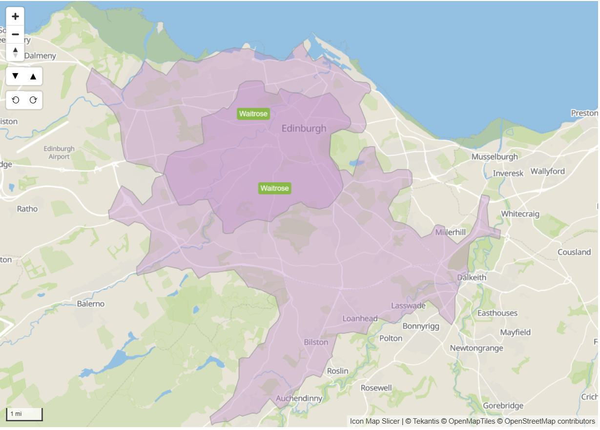
The map below shows the 15 minute drivetimes around 2 Waitrose supermarkets in the city of Edinburgh in Scotland. The darker purple area indicates where the 2 stores drivetimes overlap. The positive aspect to this is that people living in this area have more choice of where to do their shopping, the negative aspect being the potential cannibalization from each store. Future site planners may consider potential sites e.g. Musselburgh that are not covered by either stores catchment areas.
The other advantage is communication. It is easier to explain trade-offs with a map than with a dense scoring model, especially to stakeholders who are not deep in the data.
5. Clearer local marketing and ranging decisions
Once you can see catchments and neighborhood profiles, local decisions stop being guesswork.
You can start tailoring:
- local promotions based on nearby customer segments
- product ranges aligned to neighborhood demographics
- staffing assumptions aligned to local patterns of activity
- outreach to areas with high potential but low current penetration
This is where location intelligence becomes operational, not just analytical.
The reality: external data is powerful, but messy
This is the part many teams run into quickly. External datasets, whether free or commercial, arrive in all sorts of formats:
- different boundary definitions
- inconsistent geographies across countries
- awkward keys, missing metadata, unclear licensing notes
- files that are not designed for analytics tools, or not shaped for Power BI modeling
- huge tables that become slow if they are not prepared correctly
A lot of the work is not “analysis” at all: it is preparation. Cleaning, aligning, joining, and reshaping so that the data is actually usable.
Making it easier with Icon Map and the Icon Map Catalog
Icon Map is built to help retail analysts bring location data into everyday Power BI analysis without creating a separate GIS workflow. It is the piece that turns “we have the data” into “we can explain it clearly”.
And this is exactly why we are releasing the Icon Map Catalog.
The aim of the Icon Map Catalog is simple: we have done the hard work of preparing and structuring commonly used external datasets so you can use them immediately as context layers in your reports. That includes datasets such as demographics, and footfall style indicators, alongside other location intelligence building blocks.
Some layers will be free and widely available, others will be sourced from commercial providers where the value is high but the raw data is difficult to work with. Either way, the goal is the same: reduce the time spent wrestling with formats, and increase the time spent answering real business questions.
Example: population context by census geographies (USA)
To make this concrete, one common starting point is population and demographic context by census areas, for example:
- Population totals and density by census geography
- Age bands and household composition
- Income proxies and deprivation indicators (where available)
- Change over time where multi-year estimates apply
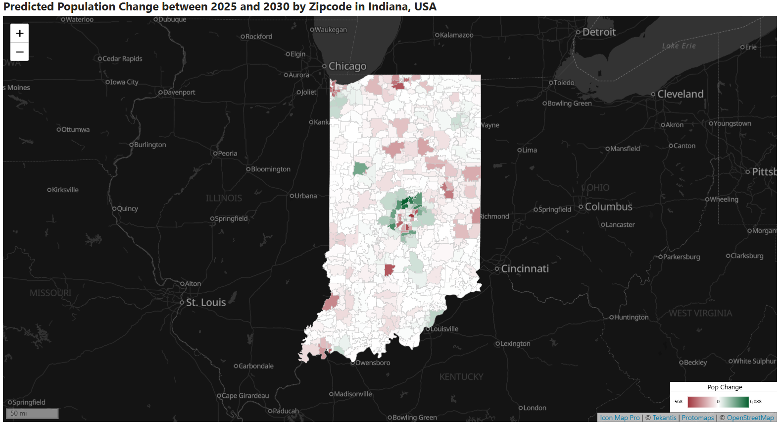
From there, it becomes straightforward to ask: “Are our high performing stores surrounded by similar population profiles, or is something else driving the result?”
Built for Power BI performance and scale
The Icon Map Catalog is designed with cloud native principles so these layers can be overlaid inside Power BI in a performant manner, without you having to build a complex geospatial pipeline yourself.
Practically, that means the datasets are prepared for analytics use, aligned to consistent geographies where possible, and shaped so they behave well when combined with your internal store and customer data.
A practical way to get started
If you want to introduce location intelligence without turning your process upside down, keep it simple:
- Pick one recurring question: uneven store performance is a good candidate.
- Map your internal layer first: store performance, customer origins, or both.
- Add one context layer: demographics is usually the easiest starting point.
- Use what you see to form a tighter hypothesis, then test it with the next layer, such as competition or footfall.
You do not need a perfect model on day one. You need a clearer conversation, and a faster path to the real drivers behind performance.
If you are already working in Power BI, maps are often the missing piece that turns a confusing set of numbers into a story that the whole business can understand. Icon Map, and soon the Icon Map Catalog, exist for exactly those moments.