
Q-Commerce moves quickly, but the logic behind it is not mysterious. It is a geography problem.
If you promise groceries, convenience items or pharmacy products to customers in minutes rather than days, almost every important decision depends on location. Which store or dark store should serve which postcodes? Where do delivery areas overlap? Which neighbourhoods can be reached reliably within the promised window? Where is demand dense enough to justify expansion, and where are service levels slipping because the network no longer matches reality?
These are not decorative map questions. They sit at the centre of how Q-Commerce networks are planned, operated and improved.
That is why location intelligence belongs inside the analytics environment where retail and operations teams already work. For many organizations, that environment is Power BI. With Icon Map, those spatial questions can be analyzed directly alongside orders, revenue, margin, fulfilment times and customer metrics, rather than being pushed into a separate GIS workflow that only a small specialist group can use.
Q-Commerce is built on spatial decisions
Traditional ecommerce already has a geographic dimension, but Q-Commerce raises the stakes. Delivery promises are tighter, catchments are smaller, and profitability is far more sensitive to local variation.
A fast-delivery network depends on the relationship between:
- stores, dark stores or micro-fulfilment sites
- customer locations
- courier availability
- road networks and real travel times
- local demand density
- competitor presence
- neighborhood demographics
- service boundaries and operating constraints
Every order has a point of origin, a destination, a route and a time expectation. When you aggregate that across hundreds or thousands of deliveries, patterns begin to emerge that are hard to spot in tables alone.
A KPI might tell you that average delivery time has worsened in a city. A map helps explain where, and why. It may reveal that one edge of a catchment has become hard to serve within target, or that two nearby stores are covering the same high-demand area while another pocket remains underserved.
That is the difference between seeing a performance issue and understanding its spatial cause.
The questions Q-Commerce teams need to answer
Most Q-Commerce teams are already asking location questions, even if they do not describe them that way.
They want to know which stores or hubs should serve which customers. They want to understand whether delivery zones are too large, too small or simply out of date. They need to assess where demand is concentrated, where service gaps exist, and where new fulfilment capacity would make the biggest difference.
They also need to connect geography to business outcomes. A neighborhood with strong order growth may look attractive, but if travel times are unreliable or the nearest fulfilment point is already stretched, expansion may not be straightforward. A catchment that looks sensible on paper may perform badly once local road layout, congestion or housing density are taken into account.
These are exactly the kinds of questions that benefit from map-based analysis inside a live BI model.
Why static catchments are not enough
Many delivery networks still rely on static or manually managed service areas. That can be useful at the start, but it rarely holds up well in an operating model that changes week by week.
Q-Commerce networks shift as demand patterns move, stores gain or lose capability, courier capacity fluctuates, delivery partners change, and local traffic conditions affect achievable service levels. A catchment drawn once is not a strategy. It is a snapshot.
What matters is the ability to analyse catchments alongside actual performance.
For example, a team might compare nominal delivery areas with real order density, average fulfilment time and failed delivery patterns. They might discover that two nearby locations are competing for the same demand, or that a seemingly low-volume edge area is underperforming because the promised service time is no longer realistic for that road network.
This is where Power BI becomes especially useful. The map does not sit alone. It sits beside the measures that matter, and filters with the rest of the report.
What Icon Map brings into Power BI
Icon Map adds specialist geospatial capability directly into Power BI, which means retail and operations teams can explore location patterns without leaving the reporting environment they already use.
That matters because Q-Commerce decisions are rarely made from a map alone. They depend on the combination of spatial context and operational data.
A single report can bring together:
- store, dark store or hub locations
- customer or order locations
- delivery catchments and territories
- route or flow lines
- road network context
- external demographic layers
- service-level KPIs
- demand, revenue and fulfilment metrics
Because Icon Map works inside Power BI, users can filter the map by region, brand, time period, channel, delivery partner or service tier and immediately see how the spatial picture changes. That makes it easier to move from broad network planning into practical operational analysis.
In the example Manchester Q-Commerce report, the first page starts where many network reviews start, with the question of whether the current footprint makes sense. Store and micro-fulfilment locations are shown together with delivery catchments and order density, so the relationship between capacity, coverage and demand is visible immediately. The busiest pockets of demand are not hidden in a table, and the edges of each catchment can be read against the real pattern of orders.
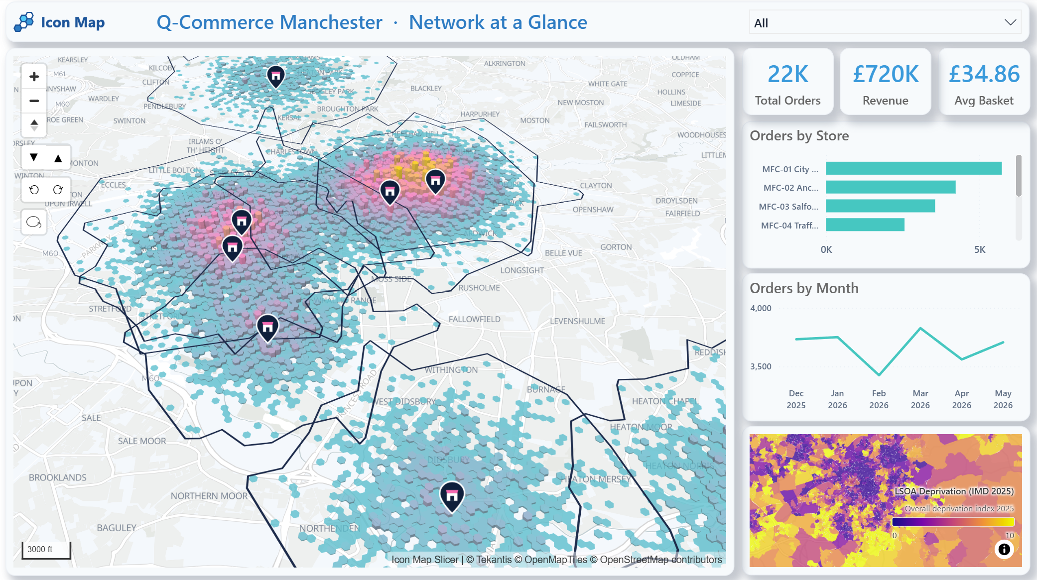
This is the kind of view that helps a team move from a general statement, such as "orders are growing in Manchester", to more useful questions. Is that growth close to existing fulfilment capacity? Are some catchments overlapping heavily while others are thinly served? Are high-demand areas aligned with the stores expected to handle them? And does the neighbourhood context explain why apparently similar zones are performing differently?
The important point is not just that the map exists. It is that the map becomes part of the same analytical workflow as the rest of the business metrics. Total orders, revenue, average basket, store performance, monthly trends and local context can all be explored together, using the same Power BI filters and slicers.
Practical Q-Commerce use cases
There are several ways this plays out in practice.
One is catchment analysis. Teams can visualise which stores or hubs should logically serve which areas, then compare that with actual order behaviour. This helps identify catchments that are too broad, too fragmented or no longer aligned with real operating conditions.
Another is coverage and gap analysis. Maps can quickly show where service areas overlap and where customers sit outside an efficient delivery radius. That is useful both for expansion planning and for day-to-day network tuning.
Demand density mapping is another strong fit. Orders are rarely spread evenly across a city. Mapping where demand is concentrated can help teams decide whether to extend trading hours, add picking capacity, prioritise a new dark store or adjust delivery promises in specific locations.
Competitor and neighbourhood context also matter. A promising zone on a revenue chart may look very different once population density, housing type or local deprivation patterns are added to the picture. Q-Commerce performance is shaped not only by internal operations, but by the characteristics of the places being served.
Service-level monitoring is perhaps the most important ongoing use case. Delivery speed, coverage and reliability change over time. Maps make it easier to see whether those changes are localised, systemic or linked to specific parts of the network.
That is where a second report page becomes valuable. Once the network footprint has been understood, the next question is whether the service promise is being met. In the Manchester example, individual deliveries are drawn from the fulfilment point towards the customer location, with the colour of each line reflecting whether that order was comfortably on time or starting to miss the target.
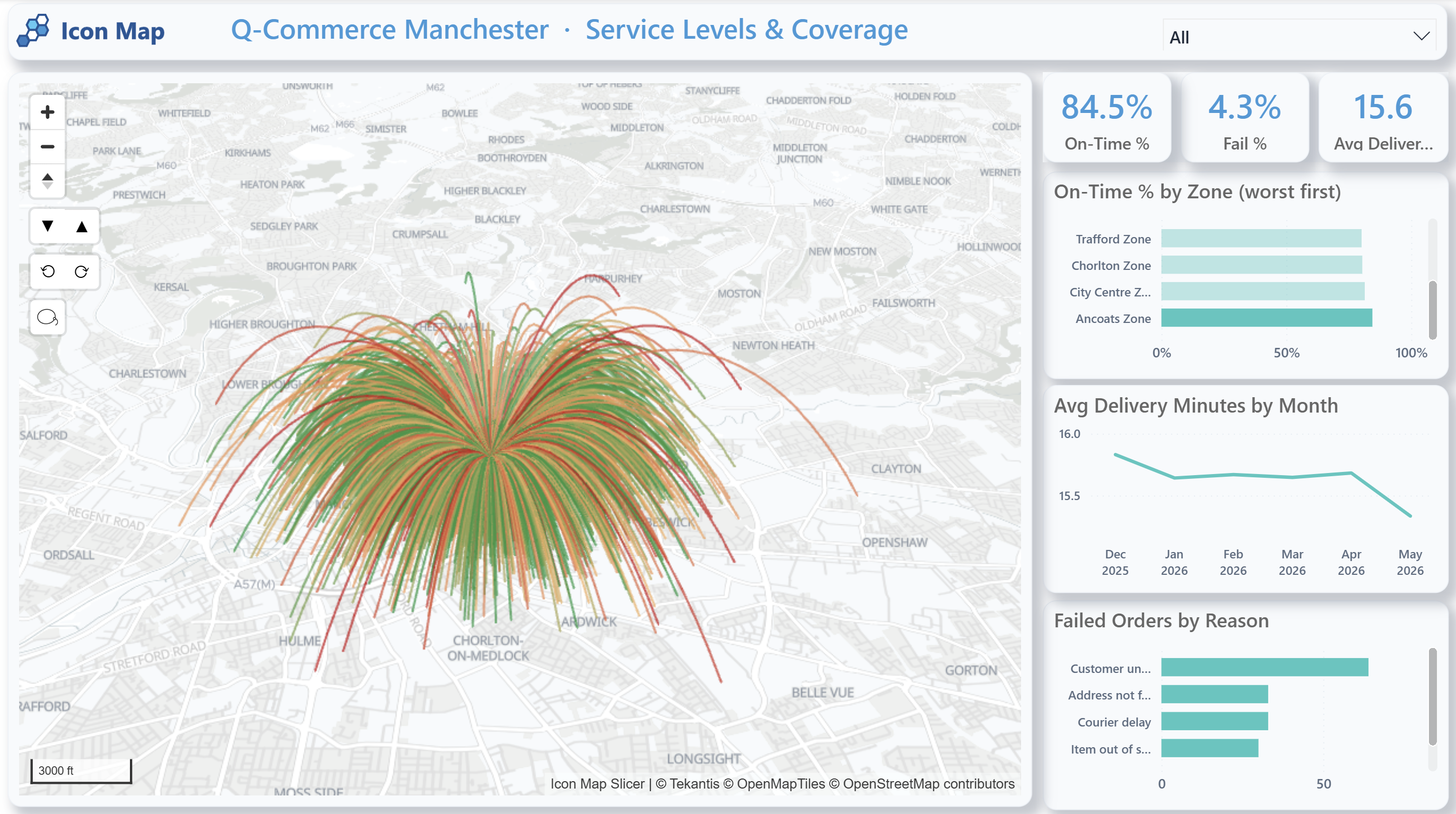
This changes the conversation. Instead of only seeing an average delivery time, the team can see the direction and geography of service pressure. A cluster of late deliveries on one side of a catchment is more actionable than a city-wide average. A store with a strong order count but a weak on-time percentage can be reviewed in context. A rise in failures can be compared with the locations affected, the zones involved and the reasons being recorded.
In a Q-Commerce setting, that kind of visibility matters because small local issues can quickly become customer experience problems. If late deliveries are concentrated at the edge of a catchment, the answer may be to adjust the service area. If failures are linked to certain locations, the answer may be better address validation, clearer delivery instructions or a different operational process. If several stores are serving the same demand pocket, the answer may be a revised allocation model.
Why external geographic context improves the analysis
Q-Commerce decisions are stronger when internal data is combined with relevant external geography.
For a UK-focused example, Icon Map Catalog datasets can add useful context directly inside Power BI. A population and density layer at LSOA level can help identify where demand potential is concentrated. A household deprivation layer can add context when thinking about affordability, accessibility and service strategy. Accommodation type data can help distinguish flat-heavy urban neighbourhoods from lower-density suburban areas, which often behave differently in rapid delivery models. A road network layer can add realism when analysing routes, barriers and travel constraints.
These kinds of layers do not replace operational data. They enrich it.
A dense urban neighbourhood with a high proportion of flats may be attractive for rapid delivery, but it may also have service challenges linked to access, congestion or delivery hand-off. A suburban zone may have larger baskets but lower stop density. A city-edge area may look close to a store in straight-line terms, but still be difficult to serve quickly because the road network is indirect.
This is also why a simple radius is often not enough. Travel-time analysis is usually more informative than distance alone, especially in dense urban areas. If you are exploring that side of the problem, our post on An Introduction to Our New Geocoding Tools is a useful follow-on read, particularly for drive-time and isochrone analysis.
Why Power BI matters
There is a practical reason this works well in Power BI. It is already where many retail, digital commerce and operations teams go to review performance.
If location intelligence sits somewhere else, spatial analysis can become occasional and specialist. If it sits inside the same reporting environment as the rest of the network metrics, it becomes part of normal decision-making.
That reduces context switching, broadens access to geospatial insight and helps teams make repeatable decisions using the same governed data environment. It also means customer and operational data can remain within the organisation's Microsoft analytics estate rather than being copied into disconnected tools for routine analysis.
For many businesses, that is the real shift. The value is not just better maps. It is making spatial analysis usable by the people who actually run the network.
From retail performance to rapid delivery optimisation
We have already written about how maps help explain retail performance in Numbers to Neighbourhoods: How Maps and Location Intelligence Explain Retail Store Performance. Q-Commerce builds on that same idea, but with a more immediate operational edge.
The question is no longer only why one store performs differently from another. It is also whether the network can deliver quickly, profitably and consistently across constantly changing local conditions.
In that sense, Q-Commerce is one of the clearest examples of why location intelligence belongs inside mainstream analytics. It is not a side exercise. It is part of how the business decides where to serve, how to serve, and what to change next.
If you also need to understand how patterns shift across both time and place, Combining Time and Location: Understanding How Patterns Change Across Geography explores that wider analytical approach in Power BI.
Location intelligence as an ongoing operating capability
Q-Commerce is not only about launch planning. It is about continuous optimisation.
Networks evolve. Customer expectations shift. Delivery performance changes by area, by hour and by season. Stores gain new roles. Demand clusters move. What worked six months ago may no longer be the right operating model today.
That is why location intelligence should not be treated as a one-off planning exercise. It should be part of the regular reporting and optimisation cycle.
Bringing that capability into Power BI with Icon Map gives retail and last-mile teams a more practical way to understand coverage, demand, routes and service performance together. And when those decisions are spatial by nature, seeing them on the map is often the quickest way to understand what the numbers are really saying.
Explore how Icon Map can help you bring Q-Commerce location intelligence directly into Power BI, from delivery catchment analysis to ongoing network optimization.