

There's really no competition. You're sort of in a league of your own.
The Challenge
MCD Global Health has been collecting geospatial data in Equatorial Guinea for over a decade, tying every household visit, intervention and breeding site to a GPS coordinate. That level of precision has been central to proving impact to donors and to keeping field decisions grounded in evidence rather than gut feeling, which, when you're trying to eliminate a disease, can feel like the right approach.
The problem was getting that data to the people who actually needed it. For years, analysis happened centrally. Field staff would collect data on Android tablets, a specialist would process it, and the outputs would land in inboxes as Excel spreadsheets or static reports. It worked, mostly, but the people making decisions on the ground were always a step behind the information that should have been right in front of them.
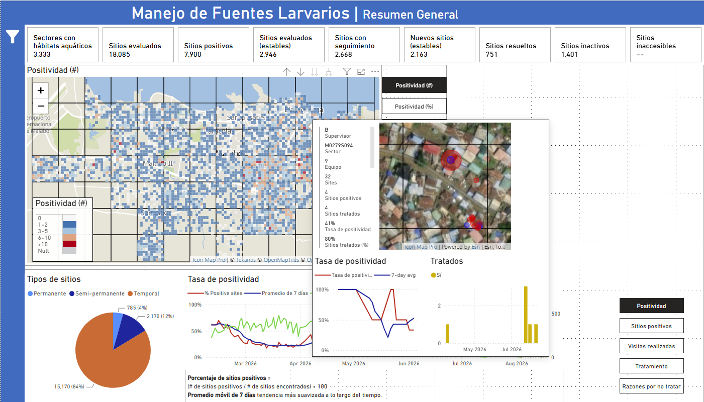
When MCD moved into Power BI, things improved, but the platform's built-in geospatial visuals quickly hit their limits. Standard Power BI couldn't display multiple geometry types simultaneously, didn't support detailed pop-ups within spatial objects, and wasn't built for the kind of layered, GPS-level analysis that malaria surveillance demands. Something had to give, and eventually something did.
How They Found Icon Map
Jordan Smith, who manages MCD's data and GIS work in Equatorial Guinea, found Icon Map the way most people find the things that end up changing how they work: by searching until something useful appeared. After starting with the standard version, MCD moved to Icon Map Pro, unlocking the features their work actually needed and, as Jordan put it, discovering there really wasn't much competition.
The Solution
Icon Map Pro was integrated into MCD's Power BI environment to build dynamic dashboards that field coordinators across Equatorial Guinea could access directly, without waiting for a processed report to arrive. Data is visualized at household and breeding site level, tied to the GPS coordinates that underpin MCD's entire surveillance system, and presented in a way that works for specialist and non-specialist audiences alike.
That last point matters more than it might sound. A lot of MCD's work involves presenting evidence to government partners and donor organizations who need to understand what's happening spatially without necessarily knowing how to read a GIS output. Icon Map Pro makes that translation feel effortless. Displaying multiple geometry types simultaneously, something that simply wasn't possible with standard Power BI visuals, has changed how those conversations happen, and how quickly decisions follow from them.
Quality control has been another genuinely useful benefit, even if it's not the most glamorous one. Field staff are working in resource-constrained environments with varying levels of technological literacy, which means data entry inconsistencies are an unavoidable reality. Icon Map Pro has made it possible to spot those issues quickly, build automated workflows that flag errors at the point of collection, and feed corrections back to the teams responsible. The feedback loop is tighter, the data is more reliable, and every decision made from it is better for it.
Key Benefits
- Field coordinators now have direct access to up-to-date spatial dashboards, removing the lag that came with centralized data processing and static report distribution.
- Geospatial data can be visualized at household and breeding-site level within Power BI, supporting the granular surveillance that malaria elimination requires.
- Automated quality control workflows have accelerated the identification and correction of data entry errors, improving the integrity of data flowing into every decision.
- Discussions with the Ministry of Health and donor partners are better supported by spatial visualization that non-specialist audiences can read and act on directly.
Why Icon Map Pro
MCD's work is built on precise, GPS-level data collection, and they needed a geospatial tool that could match that precision inside the Power BI environment they already used. Standard visuals couldn't handle the complexity. Icon Map Pro could, without requiring a separate GIS platform or any significant disruption to how the team already worked. As Jordan put it, there really was no competition, and we're inclined to agree.
What's Next
MCD is continuing to explore what Icon Map Pro can do and has started looking at Icon Map Slicer as a natural next step. With the organization's international programs expanding into new areas including cervical cancer screening and health information strengthening, there's real potential to bring the same spatial approach to a much wider range of health challenges. By Jordan's own admission, they've barely scratched the surface, and honestly, we can't wait to see where they take it.